
Creativity in printed advertising - Part 1: Photogravure and colour
Creativity in advertising almost certainly dates back far into the past. Advertising text still visible on the walls of Pompeii is just as clever as the copy seen in magazines today. But it was only around the 1850s that advances in printing enabled advertisements to be enhanced by printed illustration – and an explosion in creative visual impact took place.
Photogravure arrives
Photogravure enabled the transfer of illustrations onto printing plates. An image was photographically transferred to a polished copper plate, the image was etched onto the plate, and damp paper was pressed onto the etched copper plate, which had minute reservoirs of varying depths of ink. Our first example shows an illustrated photogravure advertisement from the Illustrated London News (ILN) in 1854. It is full of delightful images of tiny people collecting packaged tea and using it to fill the sleeping lady’s teapot.


Less august publications were also able to take advantage of photogravure to enliven and clarify their promotional message. This page from an 1892 issue of The Scottish Cyclist uses illustration creatively for two different purposes: the lower image simply displays what a customer would be buying – but the upper image explains the technical reasons for the advantages of the non-collapsible pneumatic tyre, in a way almost impossible without a subtly shaded illustration.
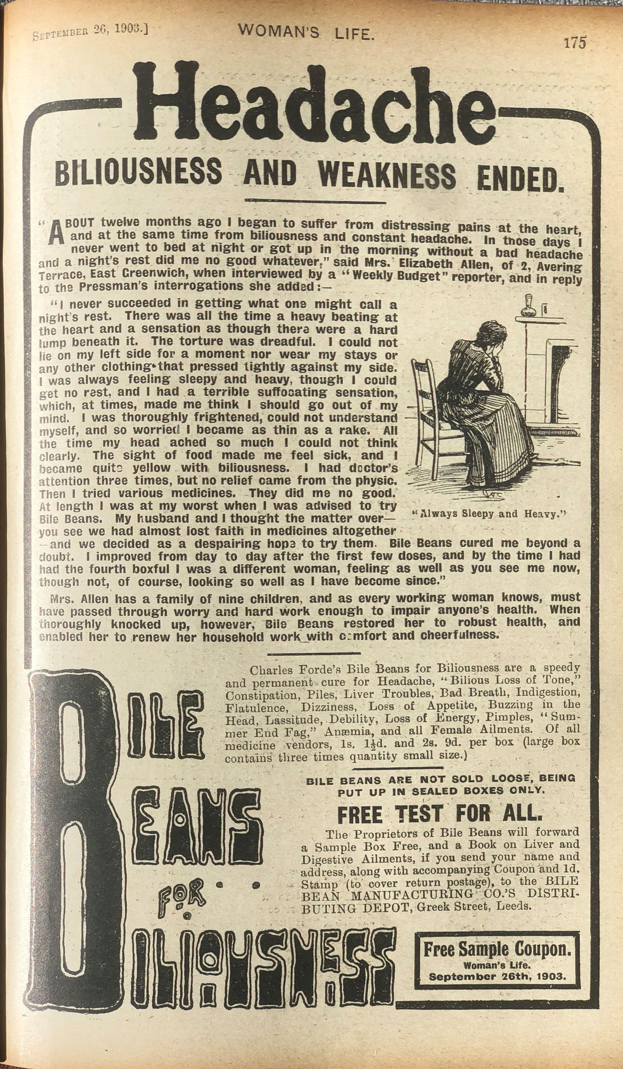
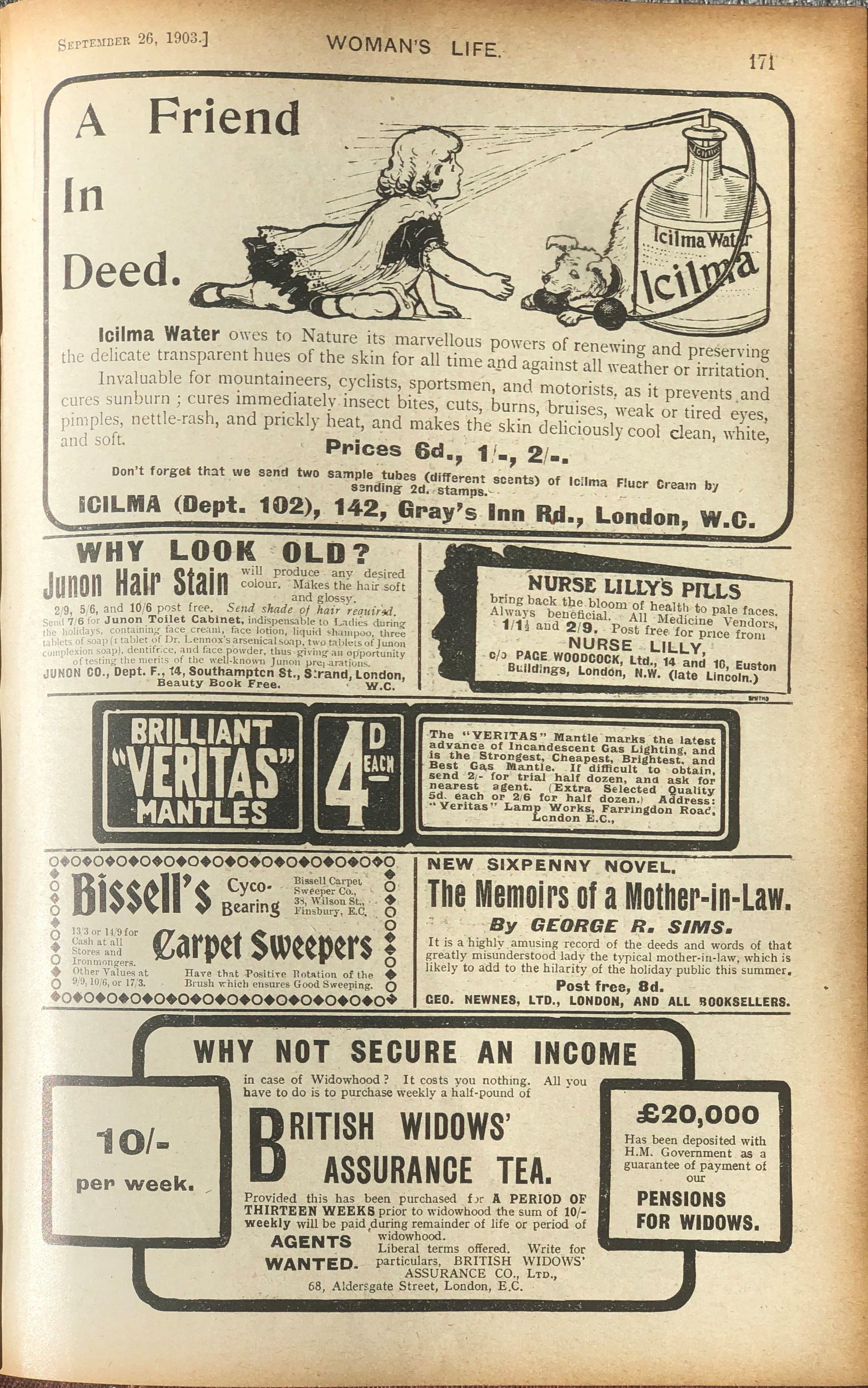
Two pages from a 1903 issue of Woman’s Life creatively used small illustrations to drive home the message of the advertisement. On the left, acres of text is no substitute for an image of a desperate woman, “Always Sleepy and Heavy”, until Bile Beans for Billiousness come to her aid. On the right, yet another panacea is advertised, but this time with the appeal of cuteness. Puppies always sell, whether Icilma Water then or toilet paper nowadays.
Humour – but of its time
By the 1900s, humour was being used increasingly in magazine advertising, aided by the clarity of photogravure illustration.

ILN (here in 1905) was only one of the magazines to run Monkey Brand cleaning bricks. It also had a curious admission: “Won’t Wash Clothes.” It did, however, clean metals and marble, crockery and enamel, and a whole host of other things.
It needs to be acknowledged that the use of the well-dressed monkey in servant’s clothes was designed to appeal to Victorian and Edwardian social attitudes. Many adverts of this time played on racist beliefs of empire supremacy and subordinance of other peoples (here embodied in the personage of a monkey) to create this ‘humour’ for its customers.
An advertisement from a 1910 ILN had a cheerful illustration for Three Nun’s tobacco. Once again, a picture was worth acres of copy.


Experimenting with colour
It was not until after World War I that colour printing became cheap enough to be used regularly in magazine advertising. Evidence for this comes from the high-quality motoring magazine The Motor-Owner, which started in 1919, and the upmarket arts magazine Colour, which started just before World War I in 1914.
The first example here comes from a 1922 issue of ILN and is for Pratt’s “Perfection” Spirit, a well-known brand of petrol. The creative use of colour gave far greater impact than could be achieved with black and white illustration. This advertisement also shows an early example of the use of an advertising series, designed to draw the reader into a longer-lasting relationship with the brand.

Bovril was a well-established brand when this next advertisement appeared in a 1923 issue of ILN. Posters, rather than advertisements, had already been going for many years, and this clever use of a competition was bound to cement the loyalty of more customers to Bovril.
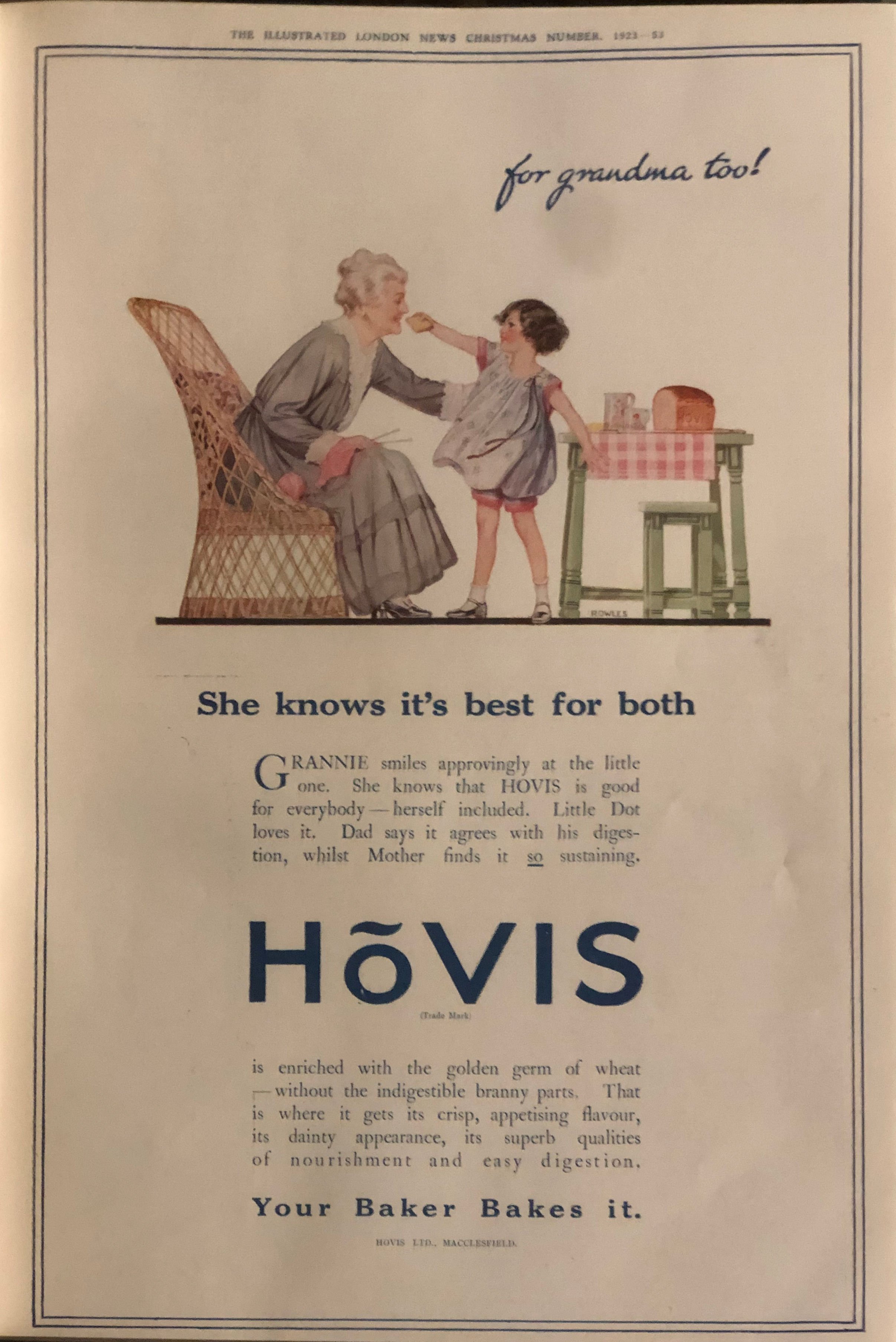
Also in ILN in 1923 comes this Hovis advertisement. The connections to the happy family are clear in the advertising copy and in the image – once again made far more attractive by the use of colour.

The 1924 ILN advertisement for Eno’s Fruit Salt is far bolder than the two examples so far shown in this section. Far less text, no detailed illustration or gentle whimsey – just a very strong colour image and a short strapline that made the clear link between a bright morning and the essential taking of a dose of Eno’s to start the day well. This gives the advertisement a very modern feel for a remarkable 99 years ago.

But this was, after all, the 1920s, and advertising to the higher echelons of society made use of more refined and muted illustrations, although no less creative. This advertisement for the wide range of Crosse & Blackwell preserves and condiments, from sardines to marmalade, was designed to appeal to those who dressed for dinner and could afford a staff of dutiful servants. Once again, colour dramatically improves the impact of the message to readers.
As the 1920s progressed, so did advertisers gain in confidence and boldness.
That will be the topic for Part 2…